Published inILLUMINATIONProductivity Through Micro-tasksThe life-hack to keep you motivated when you hit the wallJul 12, 20241Jul 12, 20241
Published inTDS ArchiveLevel Up Your Data Storytelling with Animated Bar Charts in PlotlyTransforming static plots into captivating narrativesDec 2, 2023Dec 2, 2023
Using Flourish for Beautiful Animated Plots: a TutorialA quick introduction to creating stunning visualizations without codingDec 30, 2022Dec 30, 2022
Published inTDS Archive4 Quick Tricks For Better Plots in MatplotlibEasily adding arrows, multiple axes, gradient fill, and moreJul 26, 20222Jul 26, 20222
Published inTDS ArchiveBeautiful Bars: Scaled Gradient Fill on Bar PlotsUsing color to add meaning to your plots in matplotlibJul 4, 2022Jul 4, 2022
Published inTDS ArchiveCustom Matplotlib Colormaps for Danger-Zone PlotsBuilding precise background color gradients for more meaningful plotsJun 3, 2022Jun 3, 2022
Published inTDS ArchiveData Cleaning: Automatically Removing Bad DataPurging wrong data-type entries from numeric and character columnsApr 7, 2022Apr 7, 2022
Published inTDS ArchiveBuilding and Exporting Python Logs in Jupyter NotebooksA how-to on capturing and exporting log filesDec 10, 2021Dec 10, 2021
Published inTDS ArchiveData Science in Semiconductor Process YieldUsing Machine Learning to improve fab throughput and profitabilityOct 17, 20212Oct 17, 20212
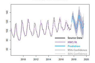
Published inTDS ArchiveTime Series Forecasting in R with Holt-WintersA template for seasonal forecastingJul 23, 20215Jul 23, 20215